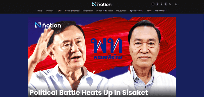
Bangkok – In what critics are hailing as “a stunning achievement in digital mediocrity,” The Nation, one of Thailand’s longstanding English-language news outlets, unveiled its latest website redesign this week to widespread confusion and mild panic.
Editor-in-Chief Patpon “Artie” Sabpaithune beamed with pride during a Facebook Live demonstration to the Thai Journalists Association, where he unveiled the site’s bold new feature: an unprecedented 57:1 ratio of blank space to actual content. “This redesign isn’t just about aesthetics,” he declared, clutching a laser pointer. “It’s about reimagining how little news a news website can provide while still being technically operational.”

A Website Redesign for the Minimalist Generation
Gone are the days when you could accidentally learn something by scrolling through The Nation. The new design features gargantuan article headers that fill the entire screen but offer no headlines—just generic stock photos of Bangkok traffic, pensive-looking people, and, inexplicably, a close-up of durian. Dropdown menus have been redesigned to aggressively invade your screen, obscuring all attempts to navigate the site. They’re reportedly impossible to close unless you smash the escape key like a gamer in a boss fight.
A New Frontier in Non-Journalism
Patpon explained the philosophy behind the overhaul: “The last site update included reducing our narrative prose to a simplistic 6th-grade level, ensuring our readers were never fully informed on the complexities of Thai politics, nor were they encouraged to think too critically of the day’s events. That was hard to top, but by maximising available whitespace to the limits of current technology it’s like we have created the ‘iPhone of news’.
While critics might argue this design actively discourages engagement with the news, The Nation insists it’s simply responding to the modern reader’s preferences. “People don’t want to read articles; they want to feel the absence of them,” explained Sabpaithune, visibly tearing up during his presentation. “We are innovators in creating not just a news website, but a newsless experience. It’s not about what’s there—it’s about what isn’t.”
Critics Weigh In
Initial reactions to the redesign have been mixed. Loyal readers, accustomed to skimming the site for actual information, expressed confusion. “I spent 20 minutes scrolling and only found an opinion piece about durian farming,” one user lamented. Others noted the irony of a site once celebrated for its investigative journalism now seemingly without an audience, “Who do they think the site is for, investors?”
One particularly disgruntled commenter wrote, “Even the 404 error page has more engaging content than the homepage.”
Digital Features Nobody Asked For
In addition to the expansive blank space, The Nation’s team has introduced several new features, including:
- Weekly features such as “Top 10 Places You Have Already Visited in Bangkok” and “Profiles of Establishment Newspaper Editors.”
- Oversized Social Media Icons, which conveniently take up 75% of the mobile view, ensuring you’ll always have somewhere else to go.
- Custom Fonts that were developed at a cost higher “than the paper’s yearly investigative reporting budget” and are unreadable on most browsers.
At press time, The Nation website had failed to load.


